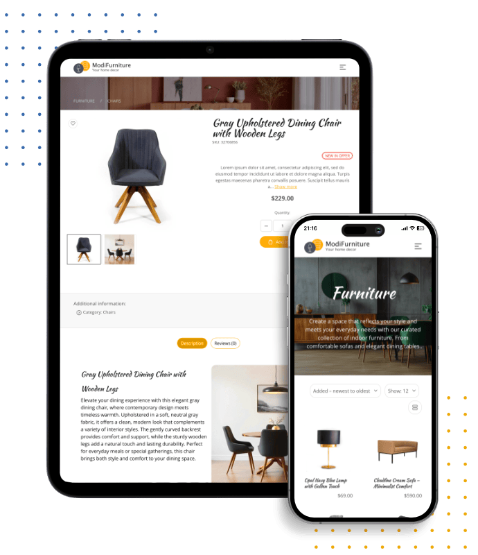
Responsive Web Design
Mobile-First Design Across All Devices
Ensure your website looks and performs perfectly on every device. With mobile-first design, your site adapts seamlessly for users across Ireland on desktop, tablet, and mobile.
Responsive Web Design for All Screens
Each website is created with responsive design at its core, providing a seamless experience across desktops, laptops, tablets, and smartphones. Your site automatically adjusts to different screen sizes, delivering fast performance, clear layouts, and a consistent user experience everywhere.
- Mobile-First Layouts Optimised for Smartphones
- Clean, Scalable Design for Larger Screens
- Adaptive Layouts That Fit Any Device
- Fast, Smooth Experience Across All Screens
Modules Built to Adapt on Any Screen
Every module and extension - whether it’s a form, product gallery, blog feed, or interactive feature - is built to be responsive by default. They retain their full functionality and visual consistency across phones, tablets, laptops, and desktops.
- Layouts automatically adjust to any screen size.
- Touch-friendly elements for smooth mobile use.
- Consistent styling and performance across devices.
- Fully compliant with accessibility and web standards.

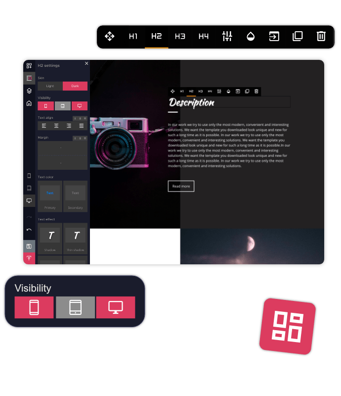
Preview and Adjust Your Site on Any Device
While building with HitMe Website Builder, instantly toggle between desktop, tablet, and mobile views. This live preview ensures your design looks sharp and lets you make changes in real time to fix issues before publishing.
- Switch instantly between desktop, tablet, and mobile.
- Preview updates directly in the editor window.
- Spot and resolve layout issues quickly.
- Accurate previews reflect real device displays.
Control Content Visibility Across Devices
Optimise your website for every device by choosing what content displays where. Show or hide certain blocks depending on screen type, keeping layouts clean and tailored to different audiences for maximum engagement.
- Show or hide content per device type.
- Craft tailored experiences for phones, tablets, and desktops.
- Remove unnecessary clutter for smaller screens.
- Boost engagement with focused, device-specific layouts.

Fast Loading, Smooth User Experience
Our builder uses streamlined code and smart loading methods to keep your website fast and smooth. A responsive design combined with speed boosts both SEO and user satisfaction, lowering bounce rates and keeping visitors engaged longer.
- Lightweight, clean code for quick load times.
- Lazy loading for images and heavy resources.
- Optimised caching for repeat visitors.
- Enhances SEO rankings with responsiveness and speed.
Responsive Website Templates
Select from modern, professionally designed templates with fully responsive layouts. Every template automatically adjusts to desktops, tablets, and mobile devices, ensuring your website looks clean, fast, and consistent on any screen size.


Frequently Asked Questions
What is responsive web design?
Responsive web design ensures your website automatically adjusts to different screen sizes and devices. Whether visitors use a computer, tablet, or smartphone, your website will display correctly with a smooth and consistent experience.
Will my website work properly on mobile devices?
Yes. Every website created with our builder is designed to work smoothly on smartphones and tablets. Images, layouts, buttons, and content automatically adjust to smaller screens for a better mobile experience.
Can I preview my website on different devices while editing?
Yes. The website builder allows you to preview your website on desktop, tablet, and mobile views while editing. You can check how your website appears and make adjustments before publishing.
Can I control what appears on mobile or desktop?
Yes. You can control which sections and content blocks appear on different devices. This helps you create cleaner layouts and provide a better experience for visitors on every screen size.
Does responsive design improve website speed and SEO?
Yes. Responsive websites are built with performance and mobile usability in mind. Faster loading times, clean layouts, and mobile-friendly designs can improve user experience and support stronger search engine visibility.
Are website templates and modules responsive?
Yes. All templates and modules are designed to work across desktops, tablets, and smartphones. Features such as online shops, contact forms, galleries, and blogs maintain their functionality and appearance on every device.