
Understanding the Importance of a Mobile-Friendly Website
In today's digital age, having a website that's friendly to mobile users isn't just a nice feature—it's a necessity. With over half of global web traffic coming from mobile devices, businesses and individuals can't afford to overlook the importance of a responsive design. A mobile-friendly website not only ensures a seamless experience for your visitors but also contributes to higher search engine rankings, as search engines like Google prioritize mobile-friendly sites in their search results. Whether you're creating a personal blog, launching an e-commerce platform, or setting up a site for your business or nonprofit, making sure your website is accessible and enjoyable for mobile users is crucial for online success.


Starting with the Right Tools
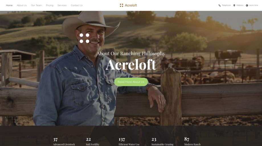
Choosing the right tools from the start can make the process of creating a mobile-friendly website both free and straightforward. Free website builders offer a range of website creation tools, including a variety of templates that are optimized for mobile devices. These templates cover a wide array of categories such as corporate, education, restaurants, medical, and more, ensuring that you can find a design that fits your specific needs. By starting with a template, you significantly reduce the time and effort required to create a site, while also ensuring that your site will be responsive across all devices.
Optimizing Your Website for Mobile Users
After choosing a template, there are several steps you can take to further optimize your website for mobile users:
- Keep it Simple: Mobile screens are smaller, so a cluttered website can be difficult to navigate. Focus on simplicity in your design, prioritizing ease of use and intuitive navigation.
- Optimize Images: Large images can slow down your site on mobile devices. Optimize your images for the web to ensure they load quickly without sacrificing quality.
- Use Large, Readable Fonts: Small text is hard to read on mobile devices. Make sure your font sizes are large enough to be easily readable without zooming.
- Implement Responsive Design: Responsive design ensures that your website adjusts to fit the screen it's being viewed on, whether it's a desktop, tablet, or smartphone. Many website builders automatically include responsive design in their templates. For more information on responsive web design, visit this page.
In addition to these design considerations, focusing on the technical side of your site can significantly improve mobile user experience. This includes enhancing site speed, utilizing AMP (Accelerated Mobile Pages), and ensuring that all your site's features work well on mobile devices. Tools and guides provided by your website builder can be invaluable in this process. For instance, exploring SEO optimization tools can also offer insights into how well your site performs on mobile devices and provide tips for improvement.


Expanding Your Website's Reach
Creating a mobile-friendly website is the first step in establishing a strong online presence, but it doesn't stop there. To truly expand your website's reach, consider the following strategies:
- Content is King: Regularly update your site with fresh and engaging content. This can be through a personal blog, updates about your business, or new product listings for your e-commerce site. Keeping your content fresh not only engages visitors but also improves your site's SEO.
- Utilize Social Media: Integrate your website with social media platforms. This not only helps in driving traffic to your site but also in building a community around your brand or cause.
- SEO Optimization: Make use of SEO optimization tools provided by your website builder. These tools can help improve your site's visibility on search engines, attracting more visitors.
- Consider E-commerce and Multi-site Solutions: If you're selling products or services, exploring e-commerce solutions can help in providing a seamless shopping experience for your customers. For businesses looking to manage multiple sites, agency and multi-site solutions can offer the flexibility and control needed to manage your online presence efficiently.
By following these steps and utilizing the tools and resources available, creating a mobile-friendly website doesn't have to be a daunting task. With the right approach, you can build a site that not only looks great on all devices but also ranks well in search engine results, helping you reach a wider audience without incurring high costs.